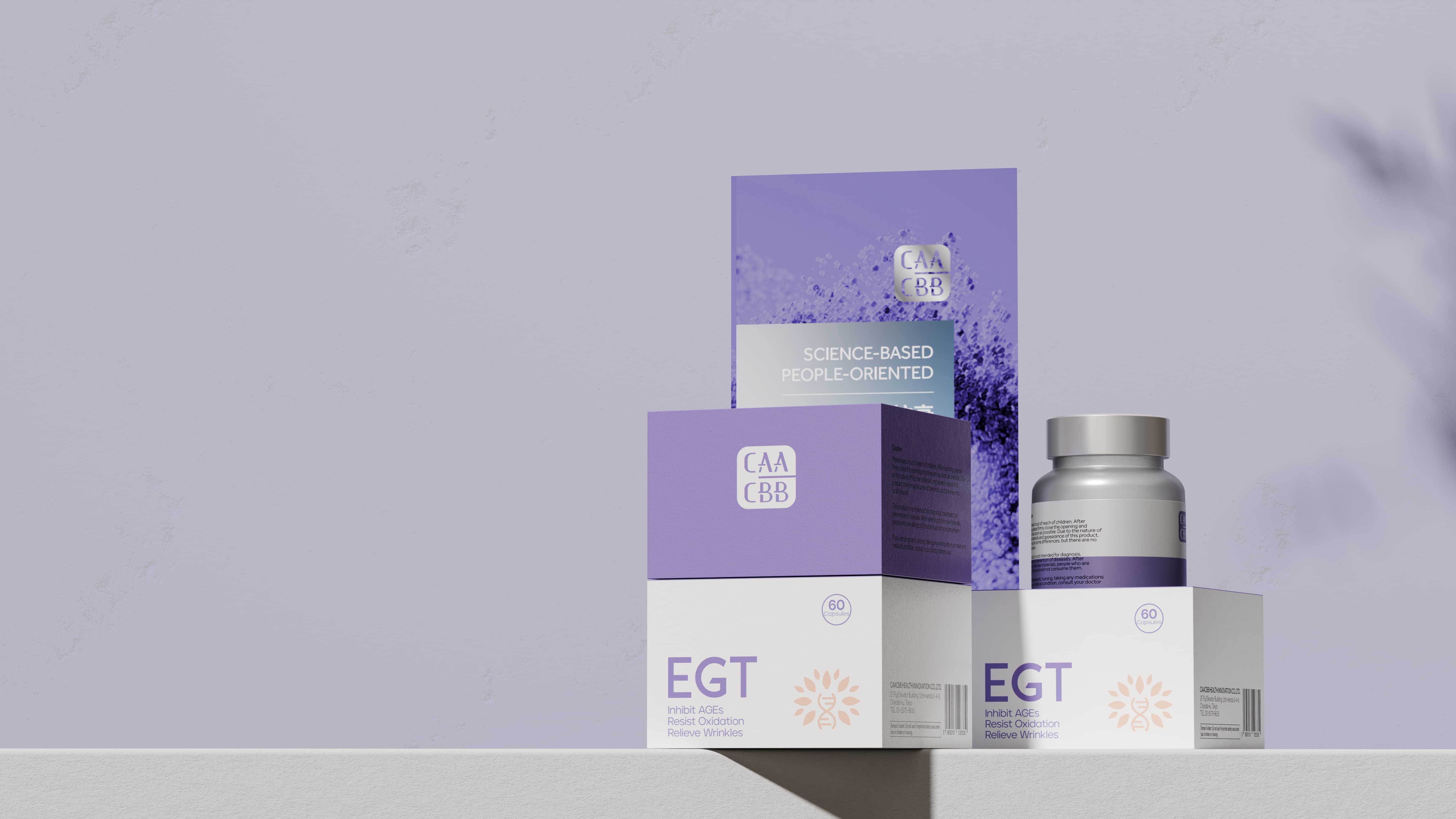
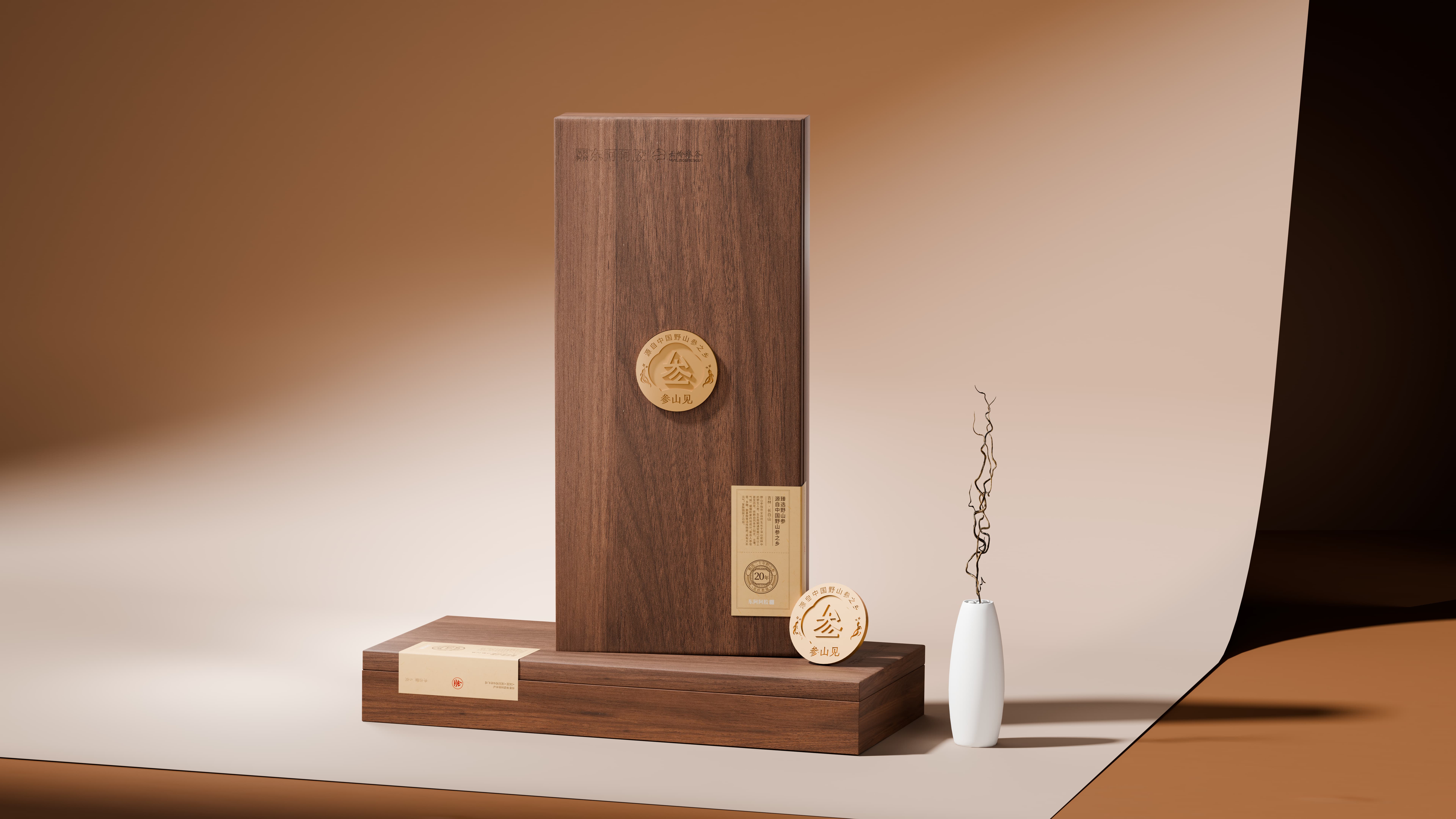
东阿阿胶·参山见
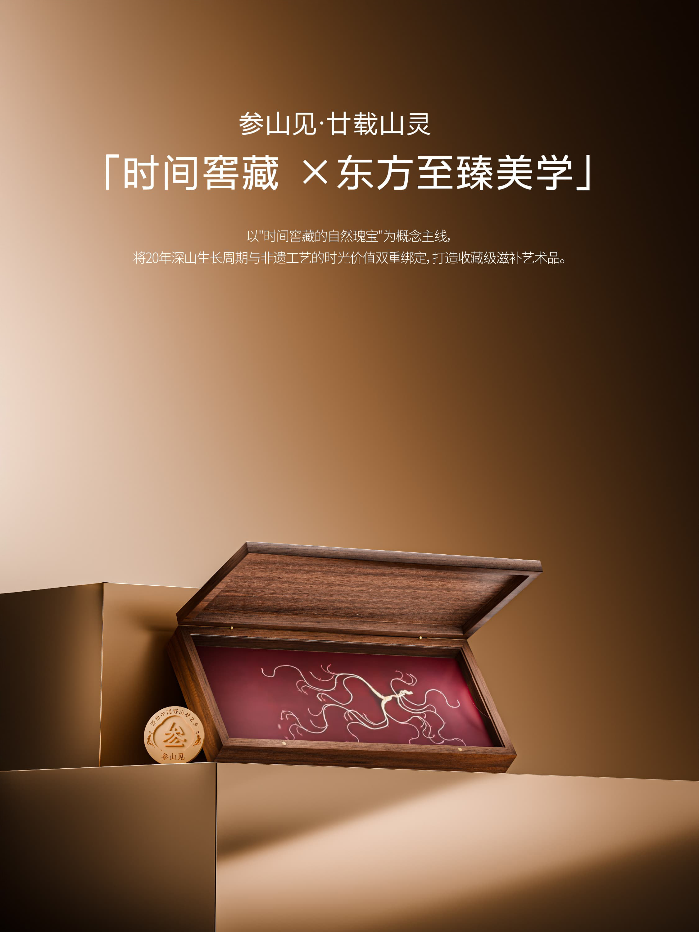
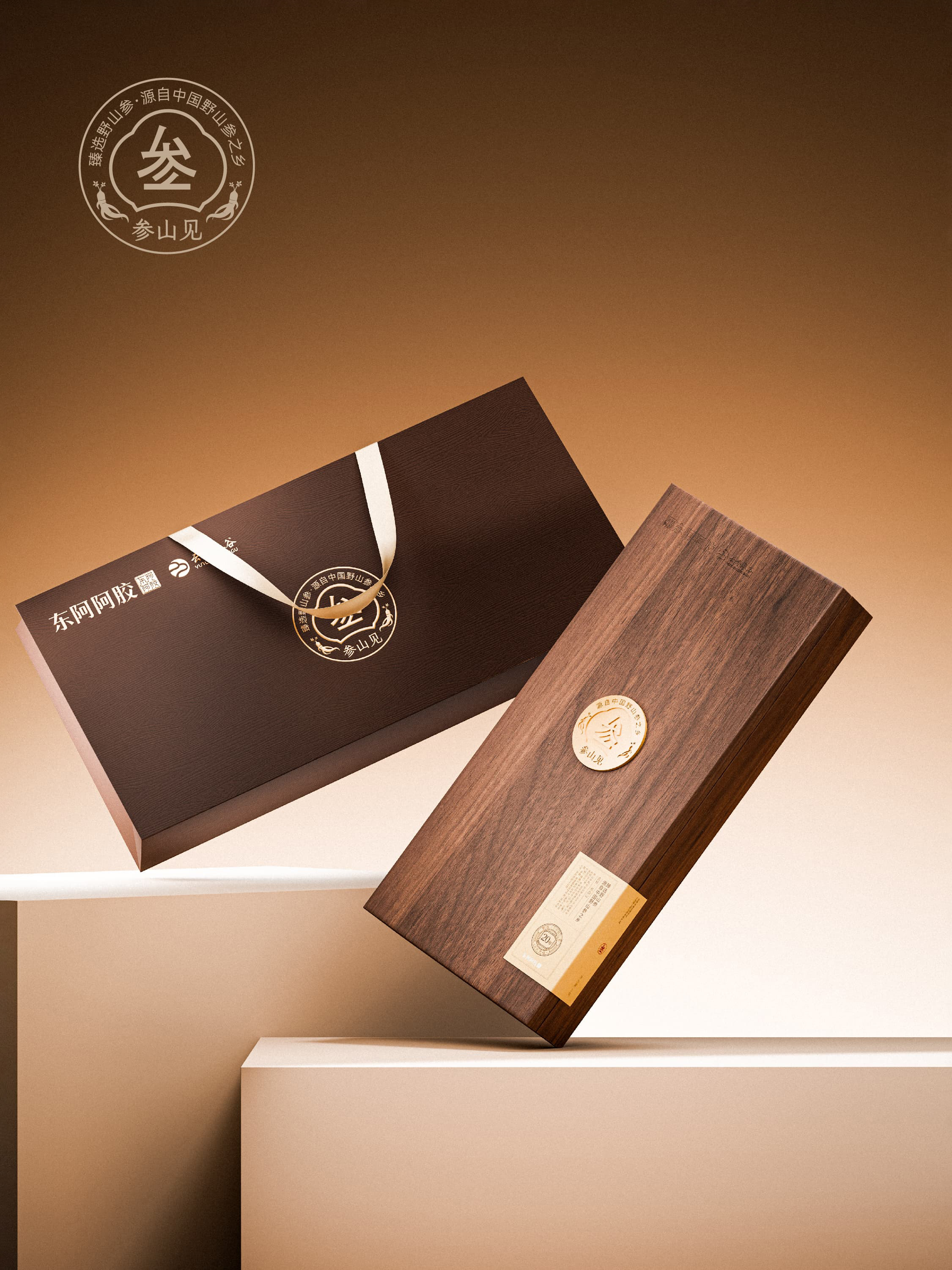
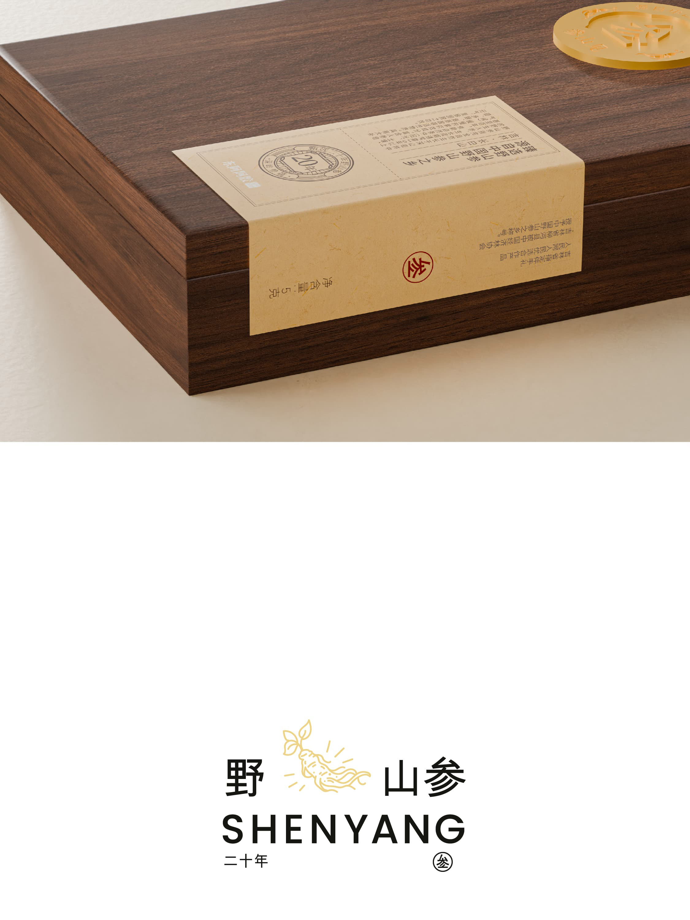
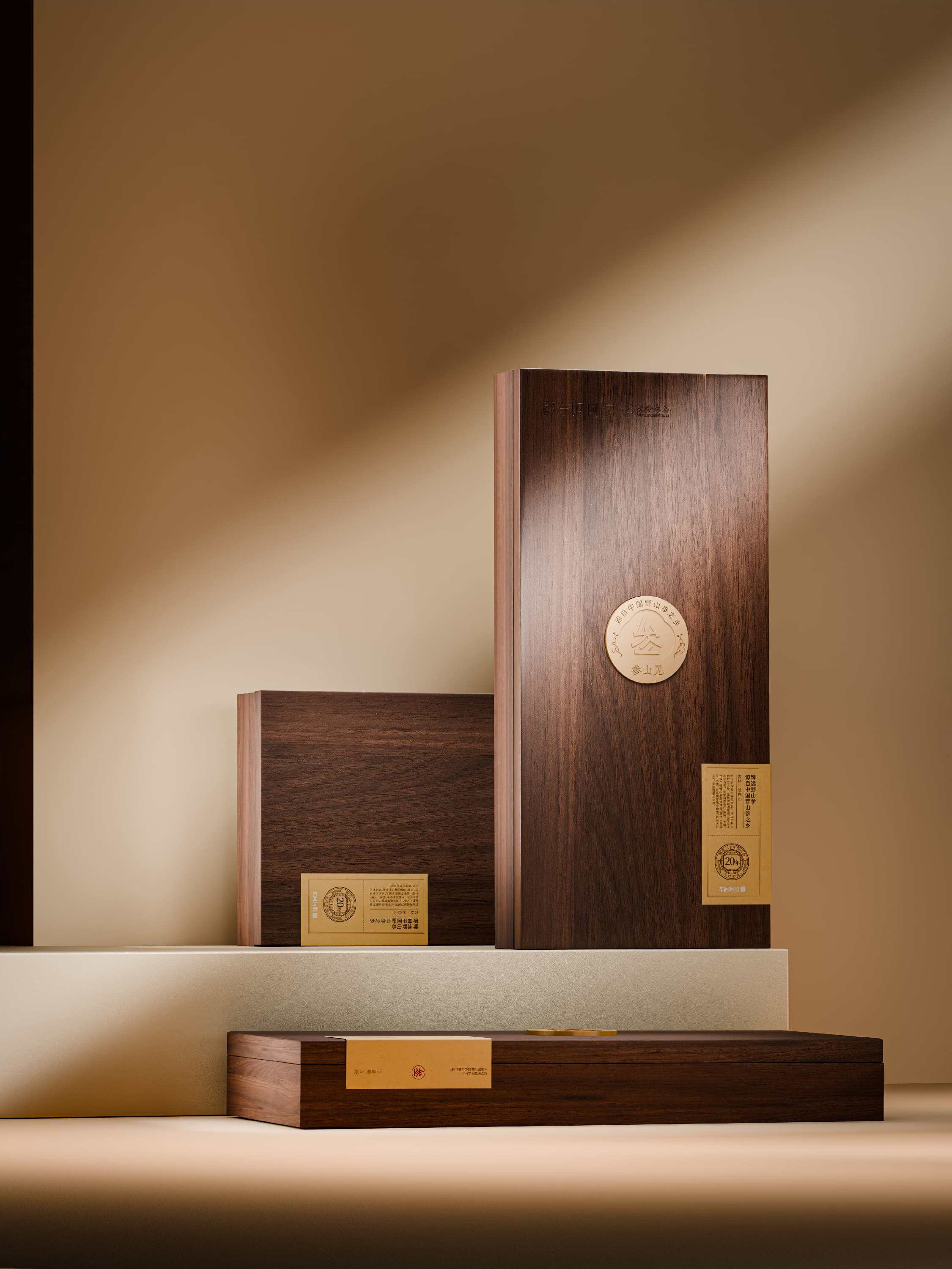
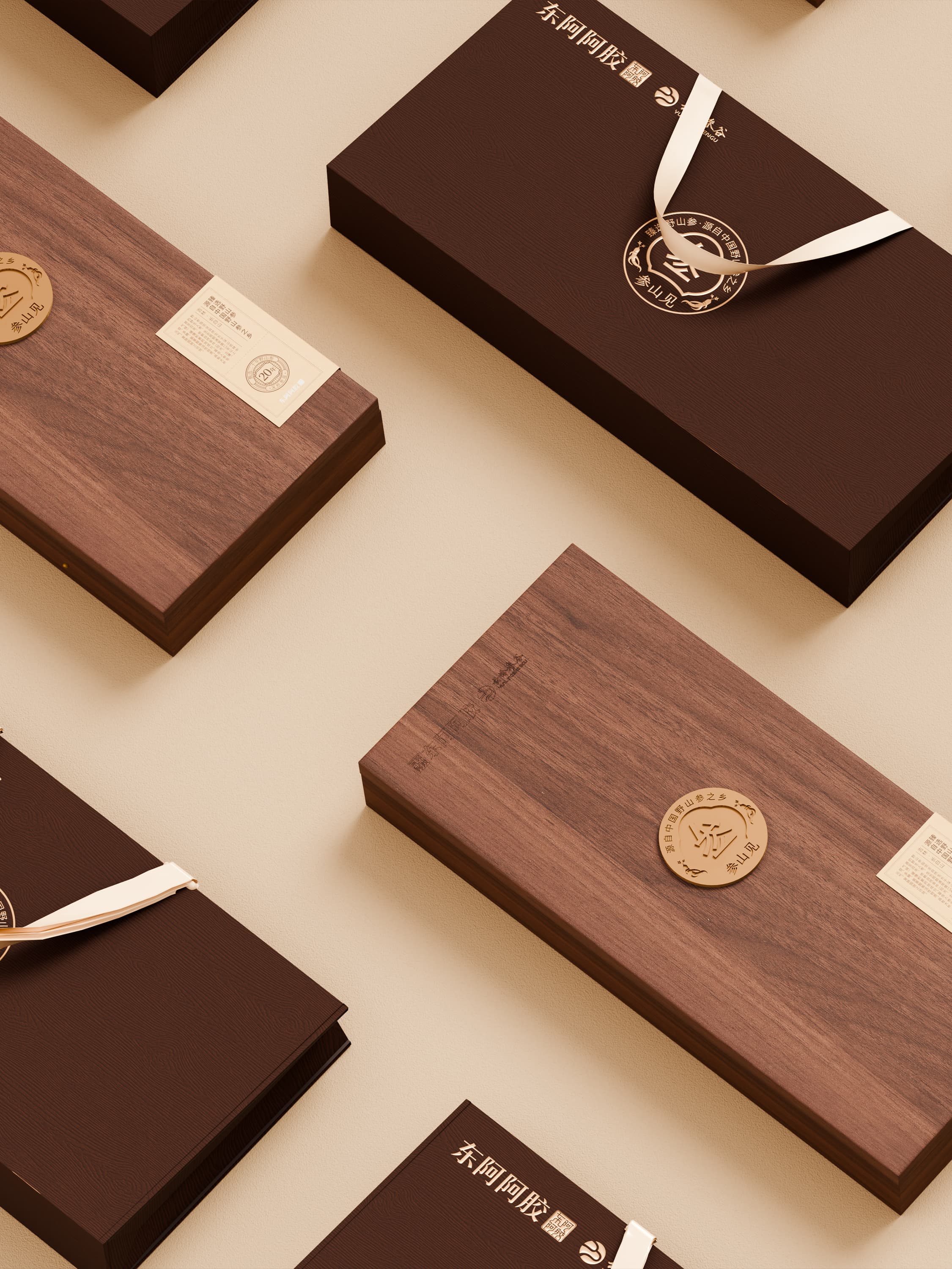
参山见围绕人参滋补价值展开,以东方自然意象连接原料产地、养生文化与当代审美。瞳创通过富有层次的品牌命名表达、简洁的包装信息与山林感视觉,塑造兼具文化气质和现代辨识度的产品形象。设计减少传统滋补包装的繁复感,让人参产品更适合年轻化、自用化与日常化消费。
Shenshanjian is built around the nourishing value of ginseng, connecting origin, wellness culture, and contemporary aesthetics through Eastern natural imagery. ToCreate used an evocative name, concise packaging hierarchy, and mountain-inspired visuals to create a product identity that feels both cultural and modern. The system makes ginseng more relevant to younger, self-purchasing, and everyday consumers.
- ART DIRECTOR
- —
- DESIGNER
- —
- YEAR
- 2025
- CLIENT
- 东阿阿胶


“新中式设计的关键,不是把传统画满,而是把东方气质留住。”