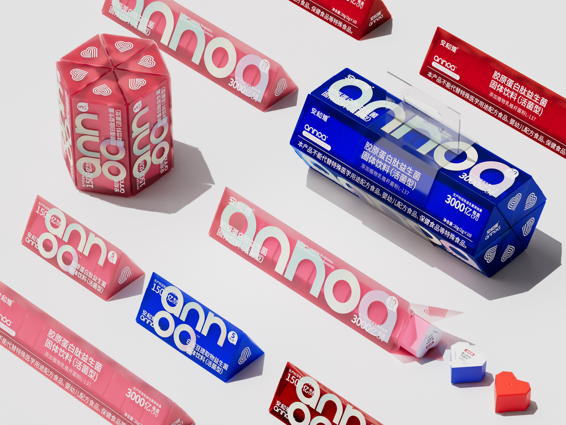
安和雅
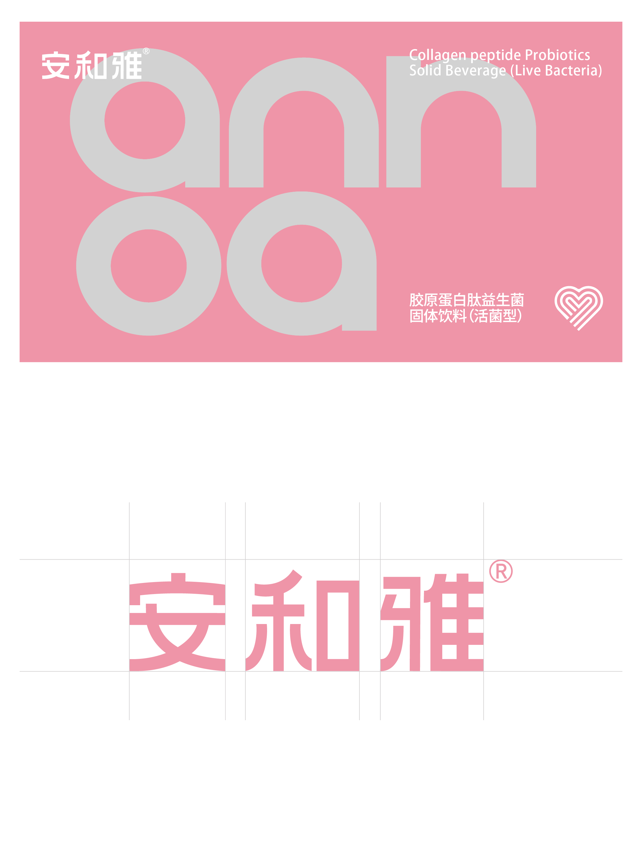
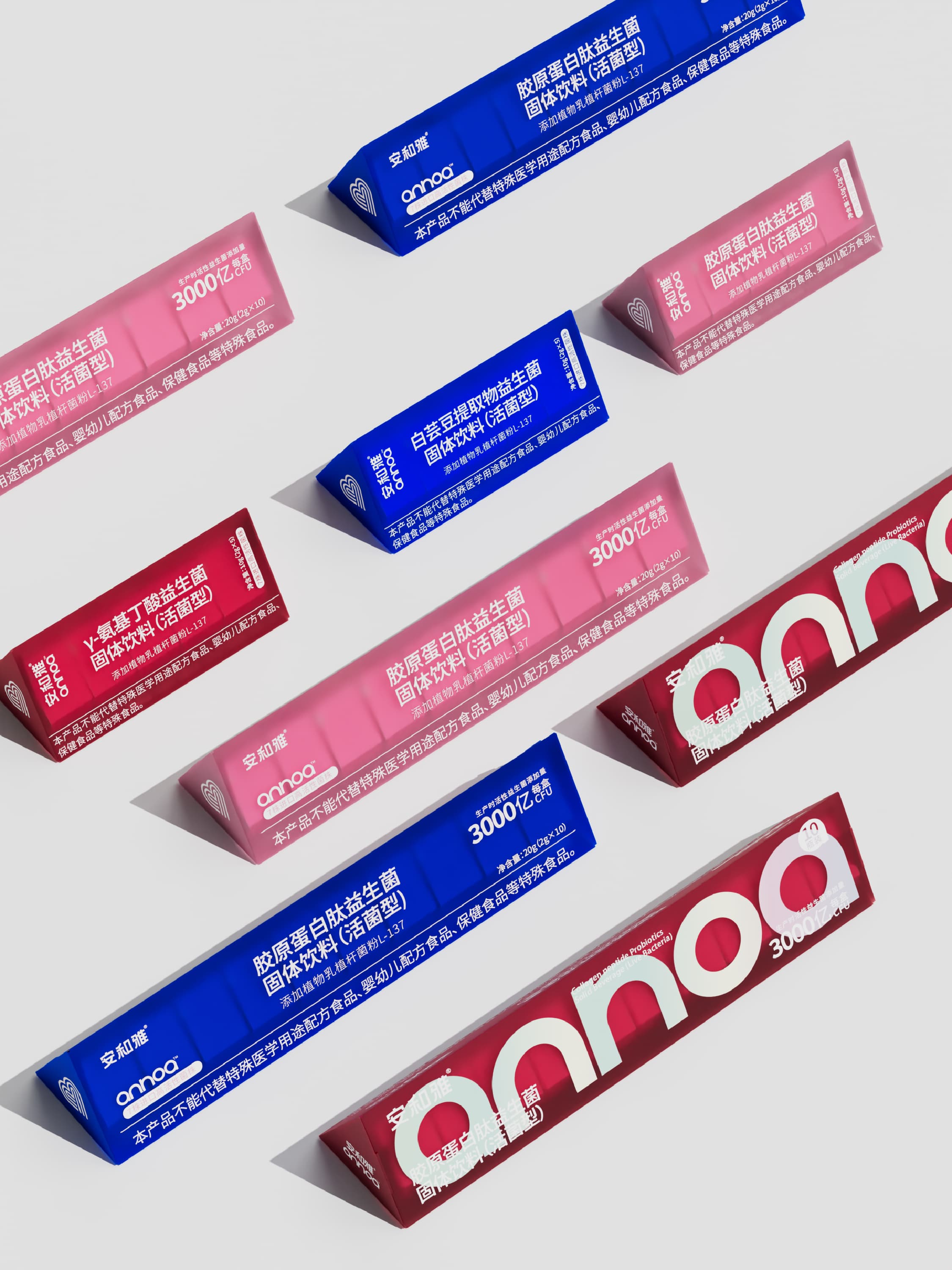
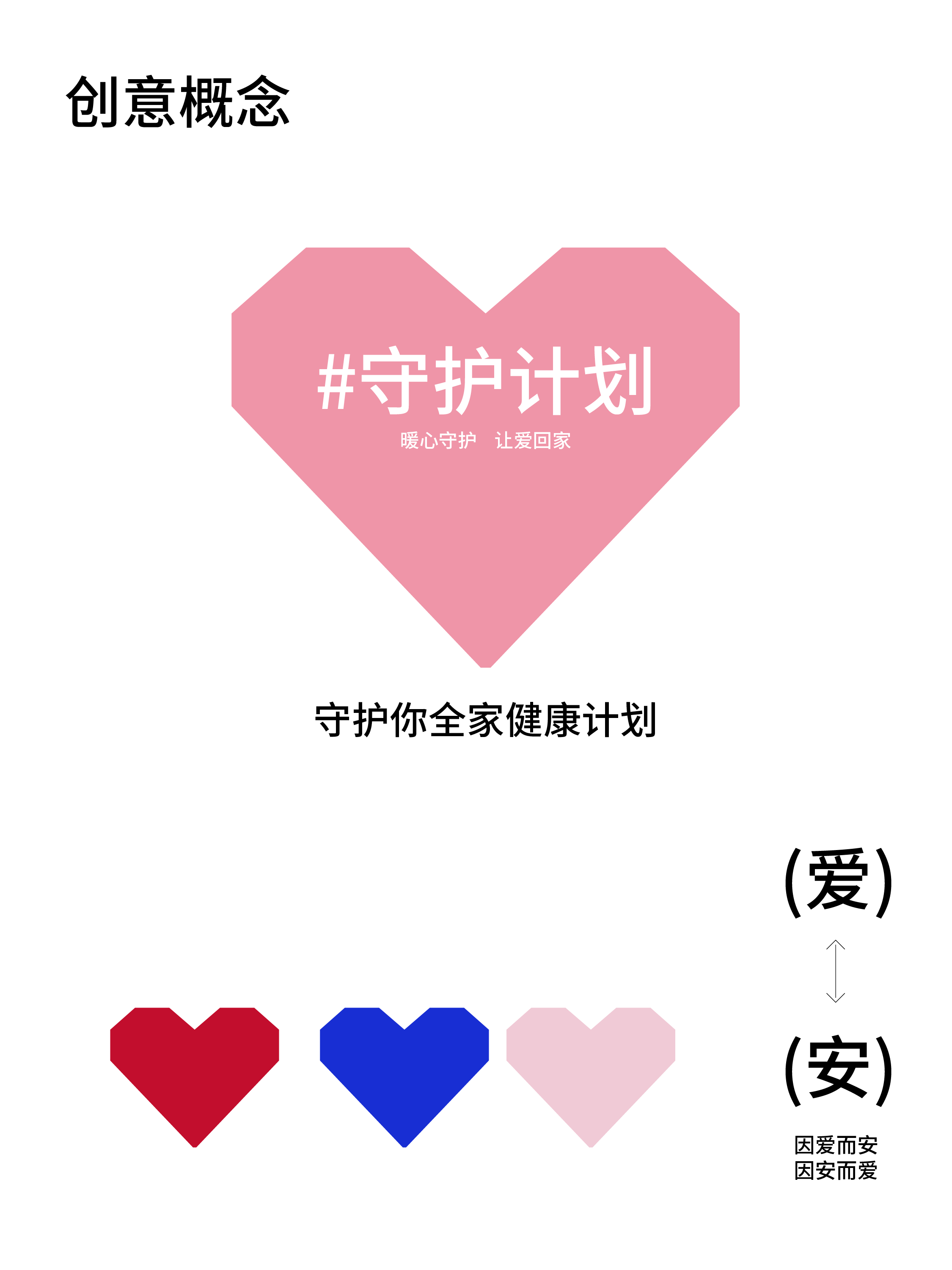
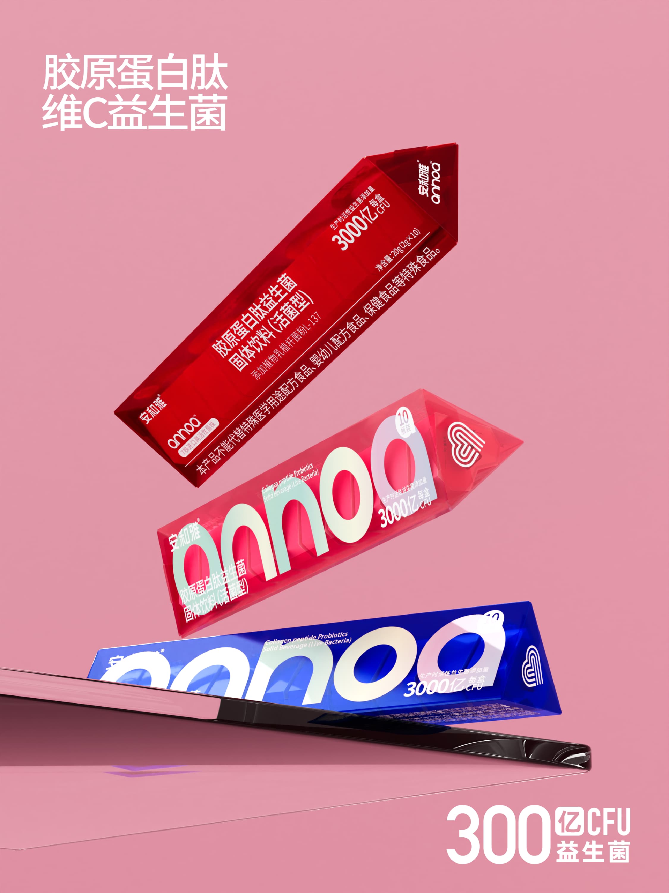
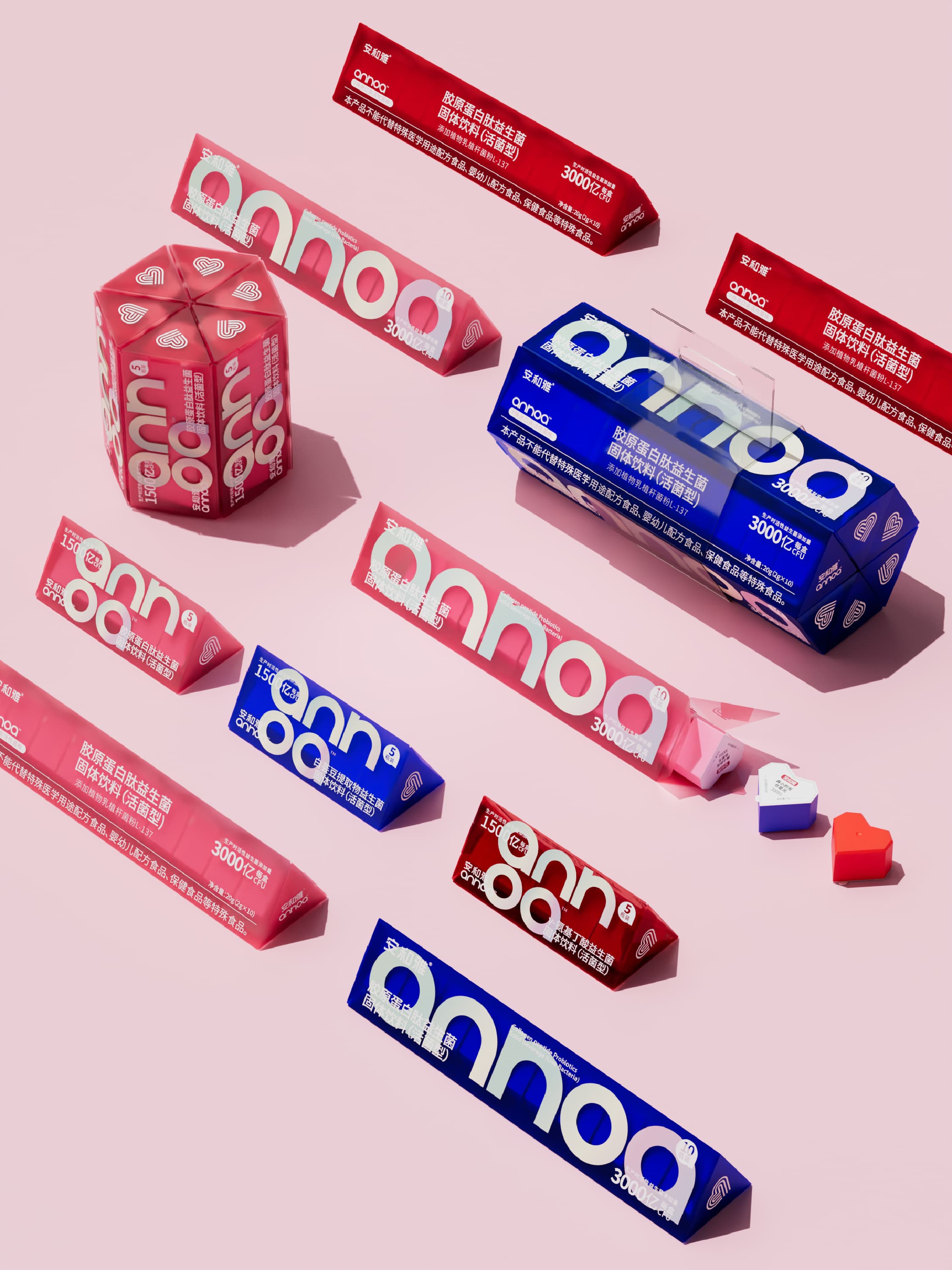
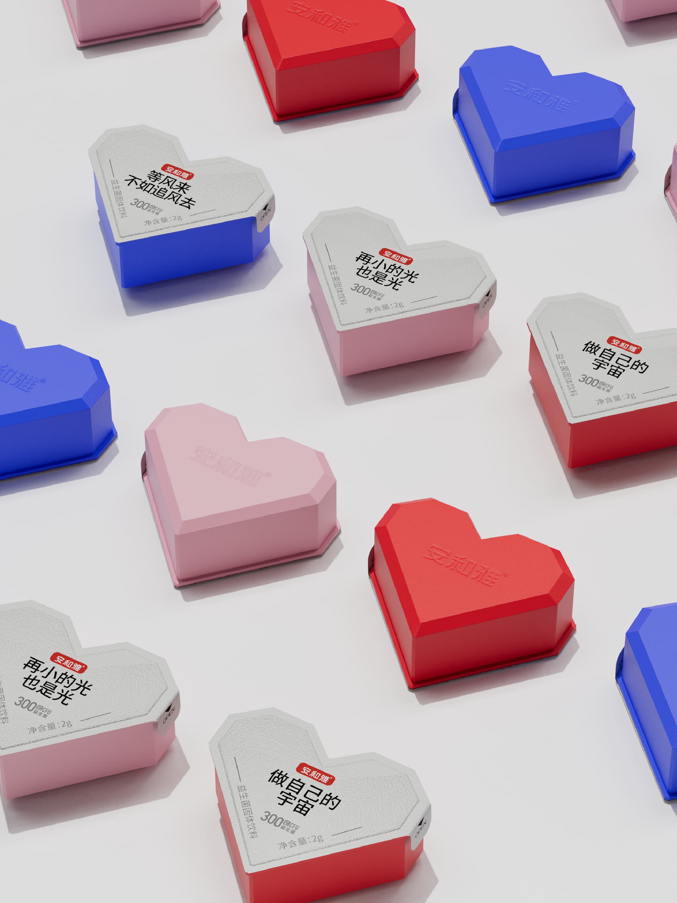
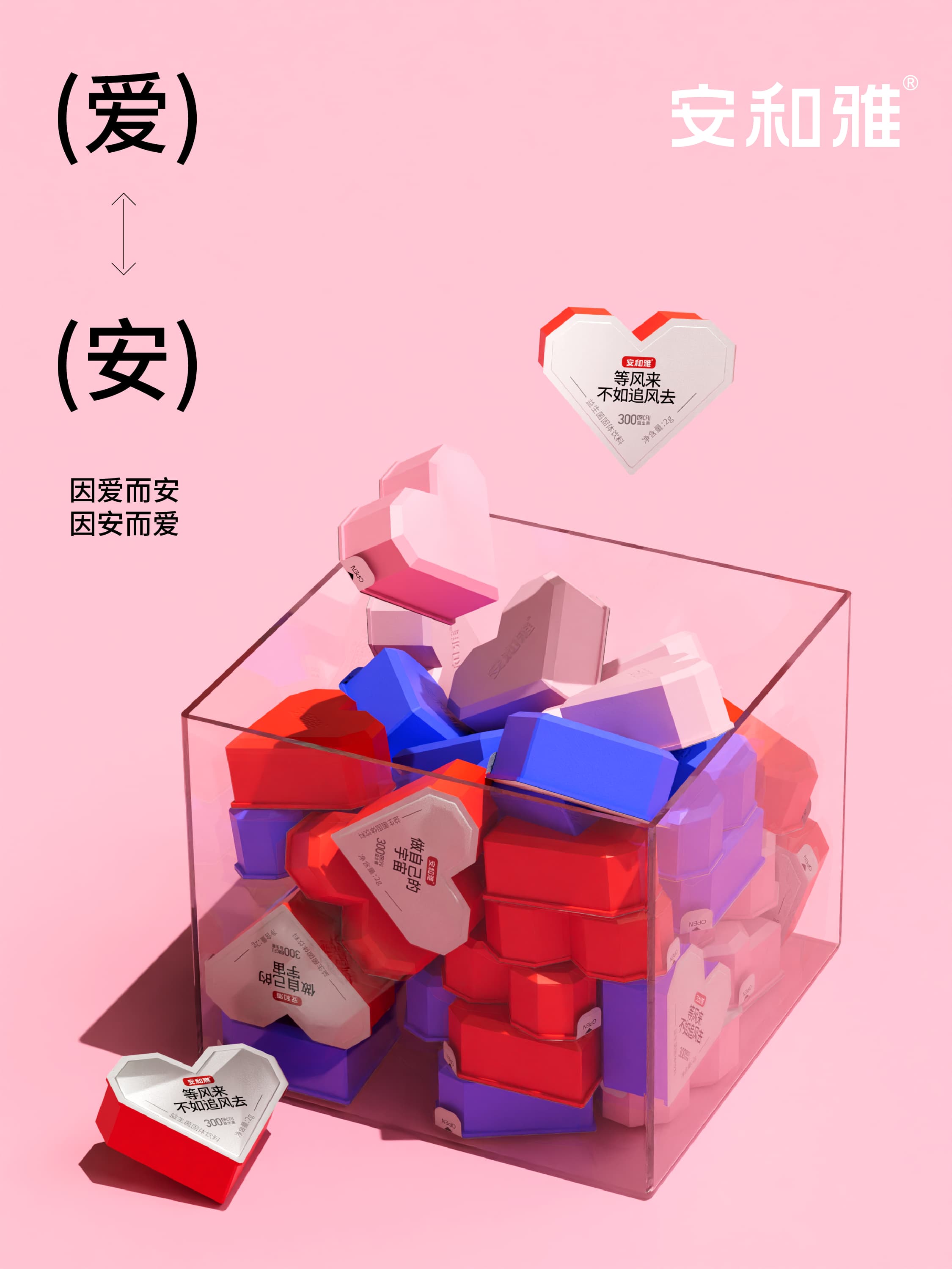
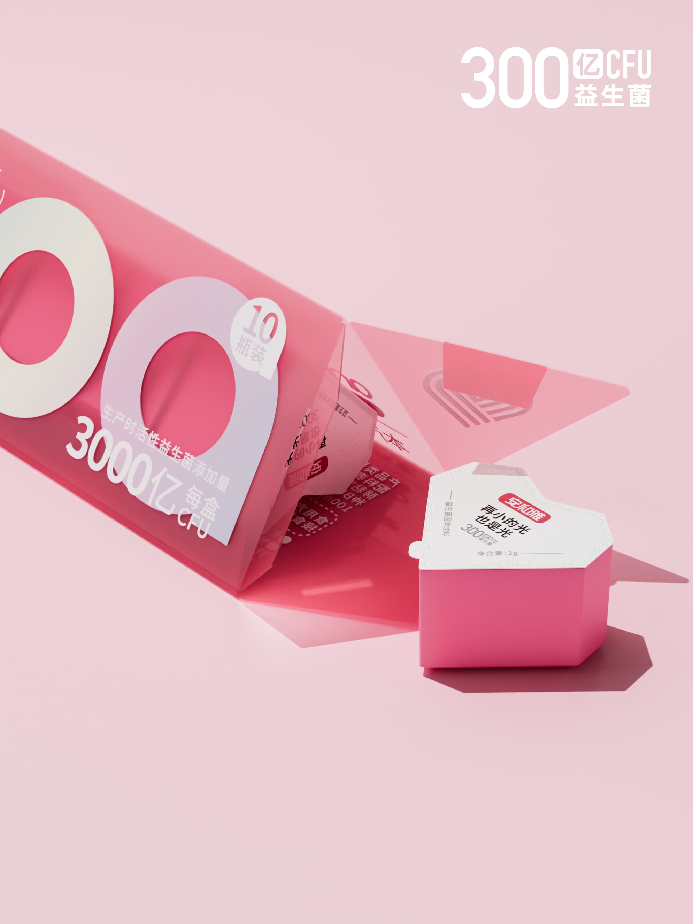
安和雅项目以“安心、和谐、雅致”的品牌语义为基础,构建克制而有温度的视觉表达。瞳创通过名称联想、色彩秩序、字体气质与包装留白,形成兼具品质感和亲和力的品牌识别,并让核心信息在复杂消费场景中保持清晰。设计以长期品牌资产为目标,避免短期流行元素对识别的稀释。
Anheya builds its identity around the ideas of reassurance, harmony, and elegance. ToCreate translated these values into a restrained yet warm visual system through typography, color, spacing, and packaging structure. The result combines premium perception with accessibility, keeps essential information clear, and establishes an identity designed to remain coherent beyond short-lived trends.
- ART DIRECTOR
- —
- DESIGNER
- —
- YEAR
- 2025
- CLIENT
- 安和雅


“高级感不是多做一点,而是知道哪一点值得留下。”